5 Principles of good design
Good design, much like anything, starts with understanding the basics. Applying the following design principles will help you avoid design disasters and allow you to communicate your key theme. You’ll find that it’s rare to see only one principle being used at a time as they all work in conjunction with each other.
Alignment
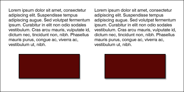
Alignment creates a sharper, more ordered design. Aligning elements allows them to create a visual connection with each other. It tightens the design and eliminates the haphazard, messy effect which comes when items are placed randomly.
Aligning elements which are not in close proximity with each other, helps to provide an invisible connection between them.
Alignment is one of the most basic and important principles of design. It allows us to create order and organisation among elements.
Repetition
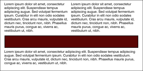
Repetition strengthens a design by tying together individual elements. It helps to create association and consistency.
The consistent repetition of an element is widely used in multi-page documents & websites. Elements can be as simple as colour, shapes, typefaces or even texture.
 Contrast
Contrast allows you to emphasize or highlight key elements within your design. Contrast is created when two elements are total opposites. This doesn’t necessarily have to be colours either. It can be achieved with fonts (classic/contemporary), lines (thick/thin) and shapes (big/small), just to name a few.
Contrast plays a crucial part in the organisation of information on a page. It will guide the reader to where they should look first or to the most important element. For it to work successfully though, it must be strong and obvious. It needs to make an impact.
Proximity
Proximity helps creates organisation. By grouping similar elements together or in close proximity, you create a relationship between those elements. It also provides a focal point and can give the reader and idea of where they should start and finish reading.
Proximity doesn’t mean that elements have to be placed together, it means they should be visually connected in someway. This can be by use of point size, font, colour etc…
Balance
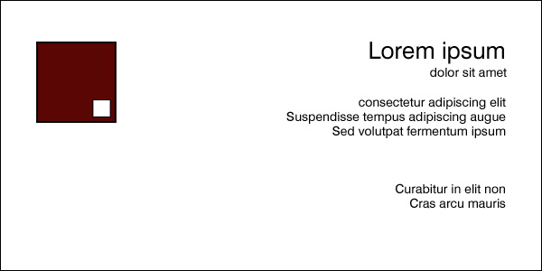
Balance provides stability and structure to a design. It’s the weight distributed in the design by the placement of your elements. The elements don’t necessarily need to be of the same size. Balance can be achieved by placing a large element on one side of your design and several small elements on the other side.
Balance can be achieved in 2 ways, either Symmetrical or Asymmetrical.
Symmetrical balance is achieved when the weight of the elements on both halves of the design is even, given a centre line. Asymmetrical balance is achieved by the use of contrast. A dark element would need to be balanced by several lighter elements.


COMMENTS
There are no comments yet.